Bridge is a design system that I created with a few developers for the student-led nonprofit organization Hack4Impact. This system is currently being used as a base to standardize design across all Hack4Impact chapters nationwide! At my university, it is being used to help teams develop their applications each semester.
Bridge is live here!
Why a design system?
At Hack4Impact, we build software for multiple non-profits every semester - we also have several internal products but there was no pattern library or style guide. Designers found themselves starting from scratch each semester, often placing more of their focus on defining aesthetics and technical implementation rather than the actual problem at hand that the client was facing. Engineers found themselves spending a lot of time building custom UI.
Consistency amidst change
As a college organization, we inherently have new members join every semester. This means that a lot of context, standardization, and learnings are lost due to the constant change of people in the organization. Whether it be for semester-long products or year-long products, people and teams are constantly shifting. Different people each contribute new styles and solutions, which in turn leads to an output of products that lack stylistic consistency and a confusing frontend codebase. So, the challenge that we are faced with is: How do we maintain the same level of excellence on all of the products that we hand off to our clients?
Focusing on more important problems
Creating a design system not only allows us to hold ourselves to a higher standard of design but also allows us to deliver consistent quality on every single product we create by using a set of components and patterns which can be customized to fit each non-profit we work with. By breaking down different design elements into homogenized components, the creation of a design system makes this entire process more efficient. Whenever designers sit down to work on a new project, they already have the necessary pieces and can focus on more complex problems like how to provide the best experience for our user instead of the button styles and spacing.
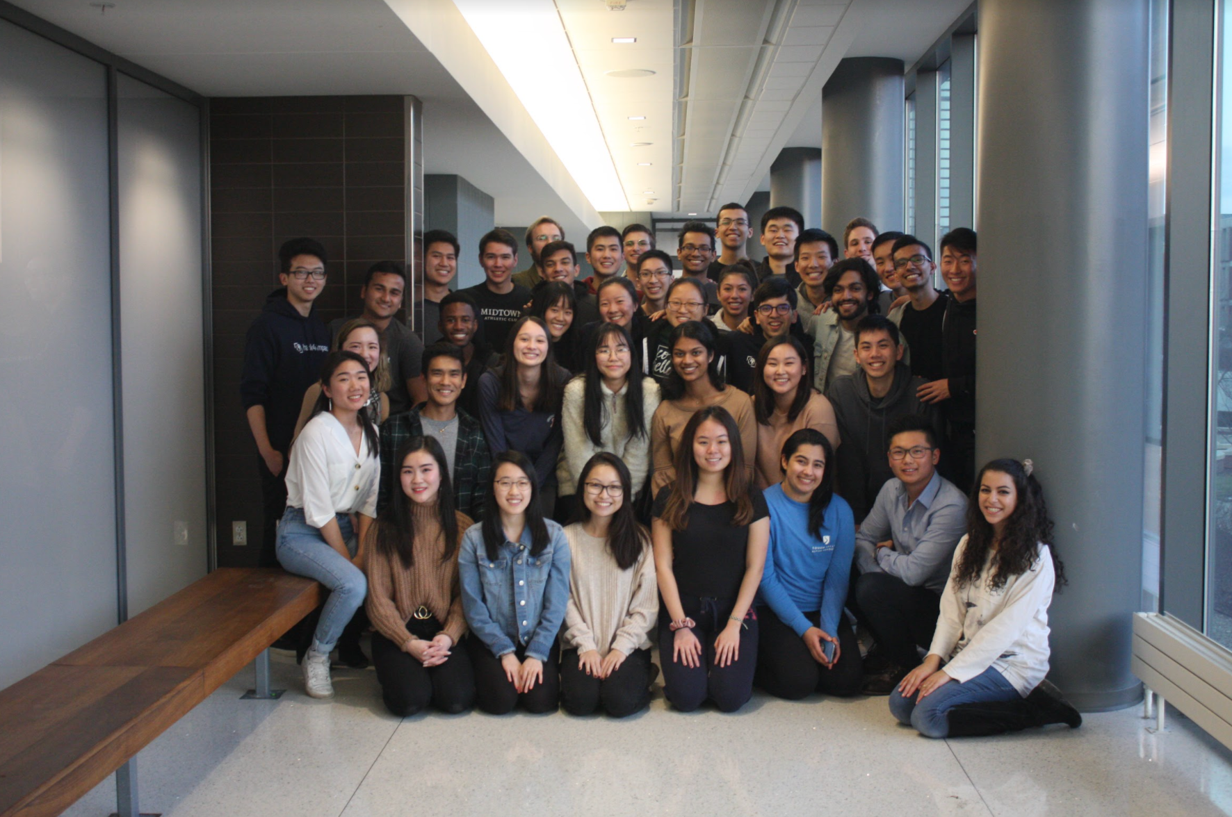
Hack4Impact Group Photo, Spring 2020
Starting Out
Because we build products for non-profits, my goal was to create a flexible but simple design system that drives efficiency through well-defined and reusable components and style guides. Although each project may make adaptions to this design system (styling guidelines based on their client), a unified deisgn system is still essential to building efficiently and better since it eliminates many miscommunication errors and allows our products to be consistent usable and beautiful.
Most of the projects the non-profits we work with request are web based - web is extremely versatile since it works well on both desktop and mobile. So the first version, I decided to focus solely on web but also making sure it would fit well responsively with all screen sizes. I looked through the Hack4Impact website as well as old projects that have already been completed, taking note of the components that I saw frequently being used as well as colors and fonts that were representative of the Hack4Impact brand.
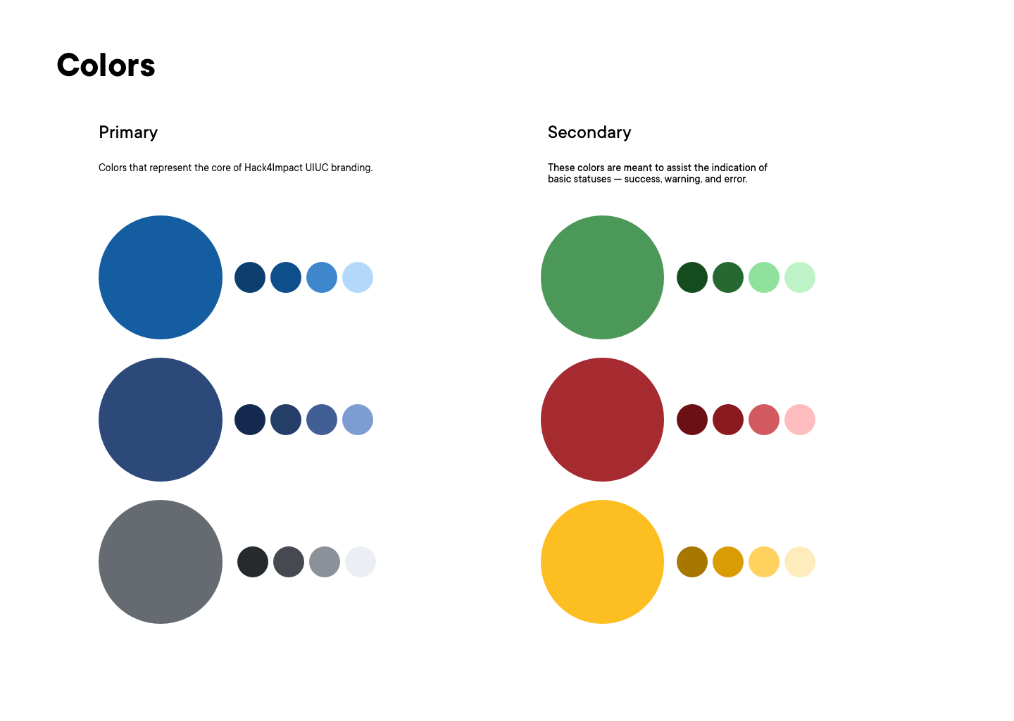
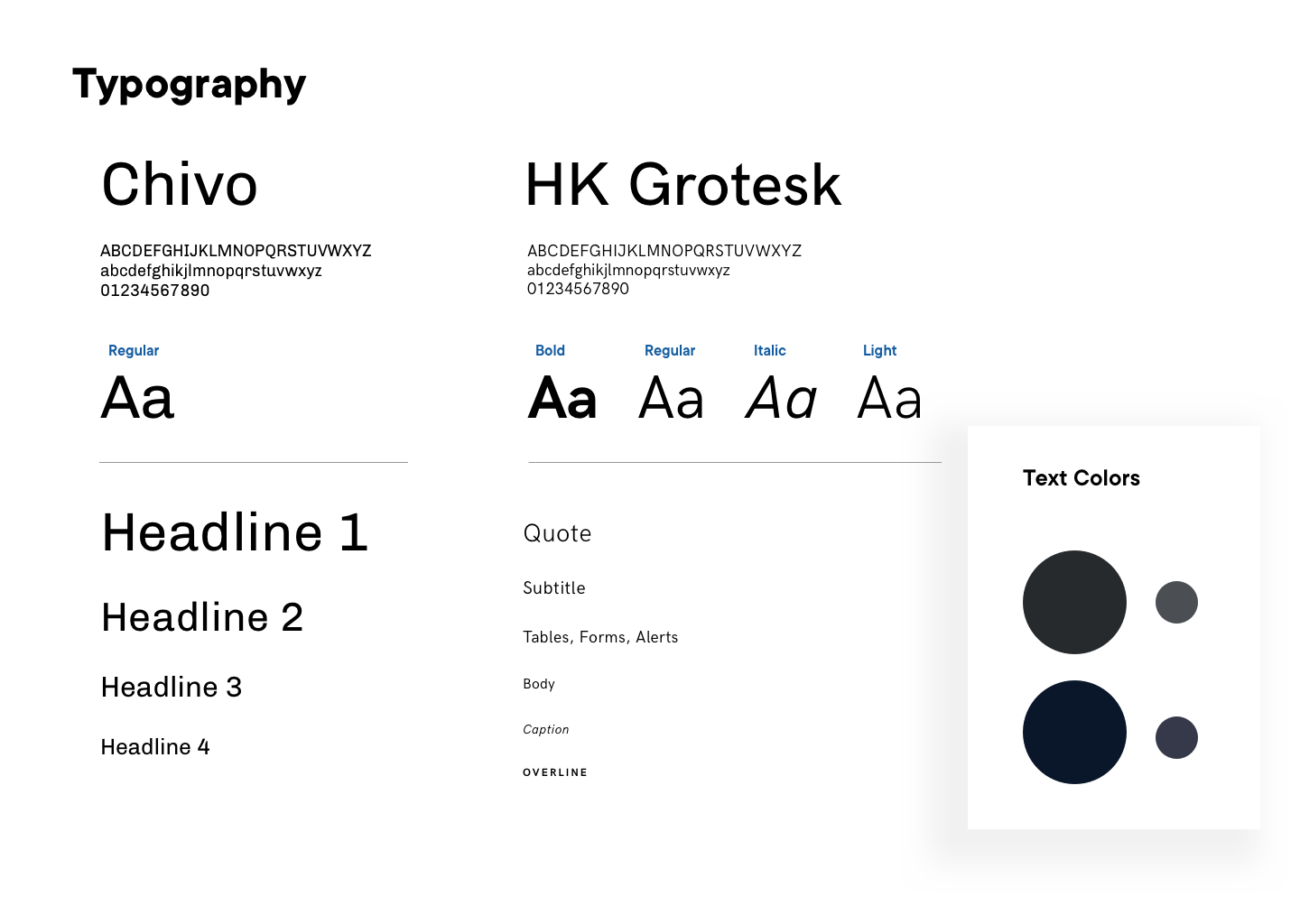
The Basics: Typography, Color Palette
At the start, I set a basic style guide that would guide us as I extended the design system. This included typography, color, sizing, and spacing. This wasn't the end all be all, and we improved and added to it as we worked on components it to fit better and be more consistent and clear. It was important that we had this to guide us but also that we weren't so stuck to it that it impeded our creativity and were flexible in modifying it.
I set the base primary colors to be consistent with Hack4Impact's brand colors, but I created the color system with the intention that they could be changed to fit the branding of the nonprofit and be flexible to their wants and needs.
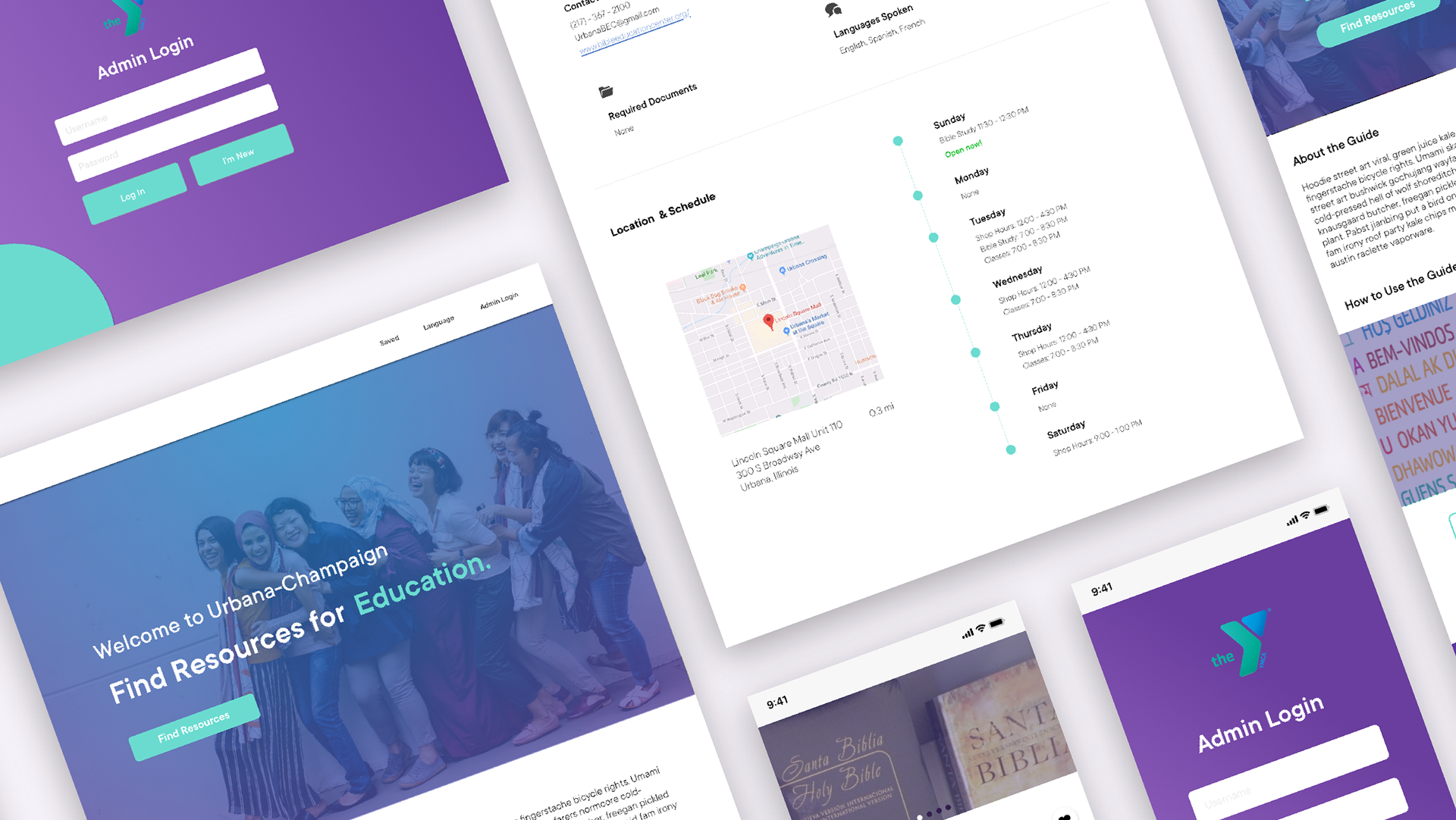
A UI/Pattern library - Components we need
Our goal was to create a flexible design system that would match a variety of types of projects, so from our visual audit, we found the most common components used in our products and prioritized them.
Collaborating with engineers here was crucial because it allowed for engineers to experiment with different ways of coding the functionality and give us feedback on the inconsistencies we may have overlooked. They kept me in check as I explored creatively. For one, I designed button styling and coloring for their different states. Buttons would have different color variants and the way they thought of it was mapping border, background, text colors to a shade of the color palette and it would transfer to different color palettes. This then applied to all of the other components, leading to a more refined color palette that would be useful in a myriad of cases.
Getting started was the hard part - designing components, reading and understanding the industry standards to the principles per component while applying that to our Design system sped by really quickly. As I designed components I noted out the Dos and Don'ts for each of them, taking into account not to over document since that may be overwhelming to the designer or engineer using the design system.
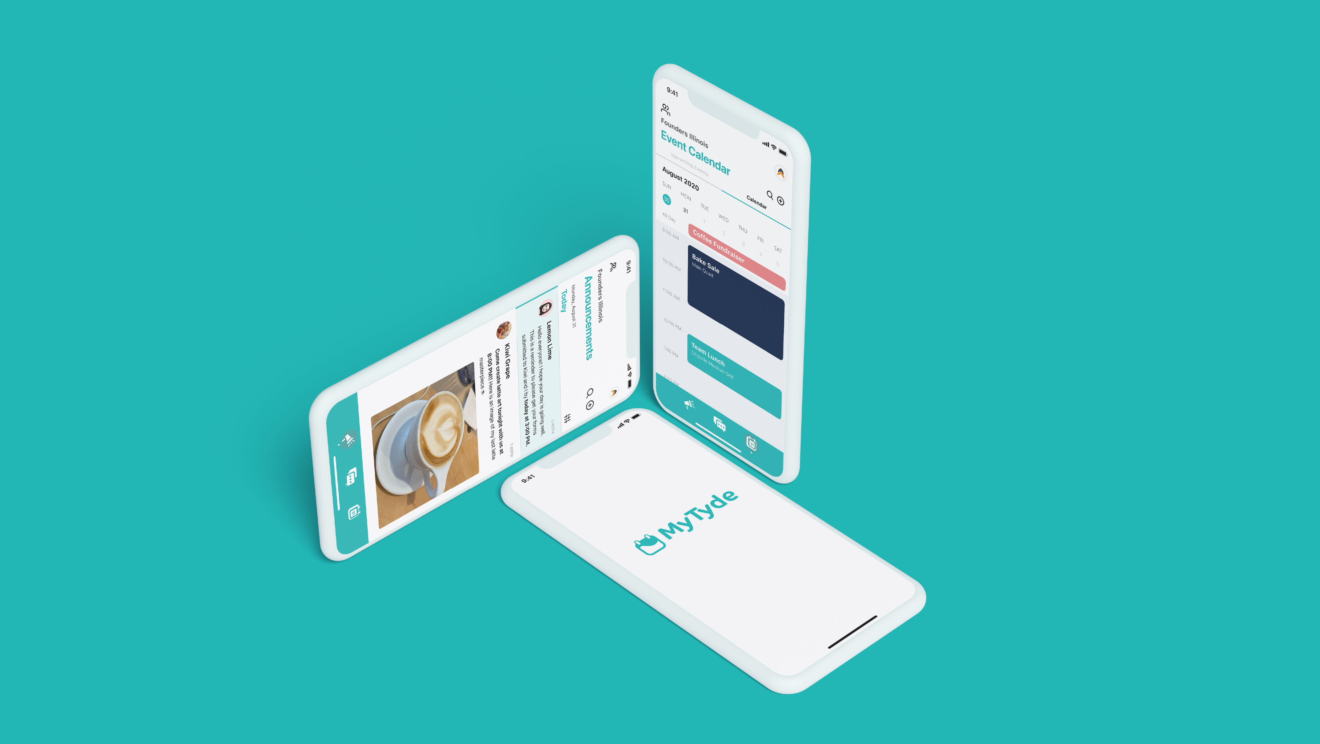
Fruits of our labor
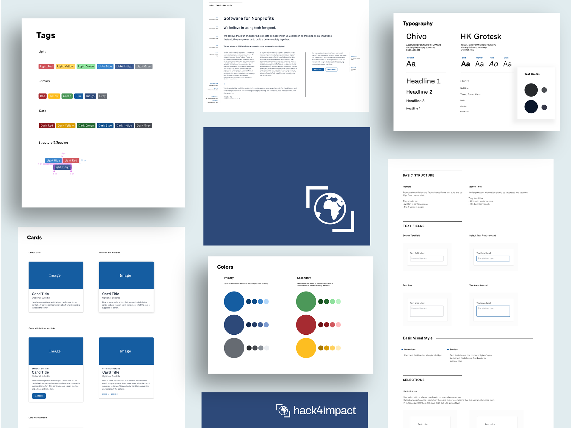
A glimpse of Bridge.
Lessons I Learned
Documentation is hard, but good documentation is necessary
A design system isn't just creating and refactoring a bunch of components, a huge part is communicating effectively how to use the LEGO blocks here to build something. Even while working with 3 engineers, it took time to just explain to them my thought process; imagine the entire organization. With good documentation, both designers and engineers can look through the documentation and be able to understand quickly and use it easily. Thus, I spent a lot of time fine tuning documentation and making it the best experience.
Lots of UI/UX Standards & Best Practices
I learned a lot in this area through designing different components and researching design systems currently being used by companies, standardizing the usage of each component in Bridge. I finally learned why elements just looked "right" when they were placed in a certain way, and learned how I could create designs that also looked "right", rather than relying on intuition. A lot of it was also staying consistent with styling across components and within components that would fit well into development - I can't just choose a shade of color because it looks nice in one context. There were always many things that I initially overlooked. Examples of this are:
Understanding my instincts
A lot of feedback I gave to designers at Hack4Impact was that elements in their designs needed more or less spacing. Now, I know that a consistent spacing system is integral to create a cohesive visual experience.
Intentionality
I originally didn't pay attention to letter spacing and line height but after I created the typographic scale and worked on multiple components, I realized I overlooked the impact of letter spacing and line height. Paying attention to both of these factors allows for more consistent design.
I had to stay consistent in coloring and styles rather than just choosing different colors because they looked nice. I learned to be intentional when selecting colors and shades of those colors. When choosing all the shades in each color palette, I had to consider their use cases in the different components they appeared in.
Understanding nitty gritty details of HTML elements and CSS, such as adding border width adding to the width of a button on top of the padding (changing a button to have an outline instead of it being filled increased the width initially.
Learning through experience
I referenced other design systems, but they don't necessarily include all of the information that I should consider (like line height), so I had to learn that these details were important on my own.
Better documentation
I researched a lot on industry usability standards, especially since it was necessary that we made Dos and Don'ts for every component for Bridge to be clear to use.
Moving Forward
Impressions
As I shared my progress with the organization, product managers, engineers, and designers were excited to use Bridge in future projects, as they saw several benefits with the implication of the design system:
- Less styling for engineers, meaning more time spent on feature development
- More time for designers to focus on user experience rather than user interface, and communicating with the intended audience for the product
Impact
Bridge is now being used as a base for Hack4Impact National, which includes all chapters across the nation. The system has also been used in several projects for nonprofits as well as personal projects.
The design system will continuously be maintained, edited and revised. We still have work to do regarding component responsiveness and accessibility, but I'm excited for the future of Bridge! :)