The YMCA New American Welcome Center is a comprehensive resource guide aimed to help immigrants to the Champaign county best access resources to ease their transition into their new homes.
I was the Product Designer for an 9 person team that included a Product Designer, a Technical Lead, a Product Manager, a Product Researcher, and 5 developers from Fall 2019 to Spring 2020.
Context
Champaign County is home to over 24,000 immigrants from nearly 80 countries around the world. The University YMCA New American Welcome Center (NAWC) is a focal point for many Champaign newcomers as they transition to their new homes. New immigrants starting a new life face many challenges: language barriers, cultural differences, and work-life balance.
In Champaign, there are over 100 resources available, ranging from healthcare to financial assistance. However, there is a large accessibility issue between those resources and the immigrants who can benefit from them.
What's the Problem?
How might we reduce barriers to reliable information on Champaign’s resources for new immigrants?
Currently, valuable information about Champaign’s resources is scattered and difficult to find, located in a single 77-page PDF file! This decentralization is creating an information gap preventing newcomers from reliably accessing resources that they need the most.
Discovery
I first synthesized the initial conversation with YMCA about their problem and the context around it, clarifying the problem, who it was for, and why - but with the understanding that the client’s viewpoint doesn’t necessarily mean it’s the best for the end user. Instead, we let user research mainly guide us.
Stakeholders
Based on my initial synthesis, I identified all the stakeholders of this project and who it was directly for.
User Research
The main goal of the project is to empower immigrants to seek resources under their own criteria. Thus, we needed to familiarize ourselves with the landscape of helping immigrants. We were able to initially interview eight individuals in the community that had stakes as part of the city government, local resource providers, the YMCA helpline, and immigrants themselves.
Our main takeaways were:
1. Engagement and trust with immigrants is difficult to build.
2. Limited resources leads to gaps in knowledge about other resource providers.
3. Immigrants may be unconfident with English or have low digital literacy.
4. Along with work/school, they are juggling family, language barriers, and other priorities
User Persona & Pain Points
I then synthesized my research and interviews into a persona for our target users, new Champaign immigrants, to better understand their needs, behaviors, and pain points.
We also identified pain points for those who were helping immigrants.
- The PDF guide contains very basic info without nuanced/complex topics
- Guidebook versions are out-of-date
- It is hard and tedious to update guidebooks, in both spreadsheets and word documents
- Resource providers don’t know who to redirect to if they can’t meet a need
What's the Solution?
Our product is a centralized virtual resource hub that will equalize and promote information access to vital community resources. This tool will allow immigrants to independently access resources according to their personal needs. This will enable the NAWC to better serve the community by offering more informed recommendations.
Ideation
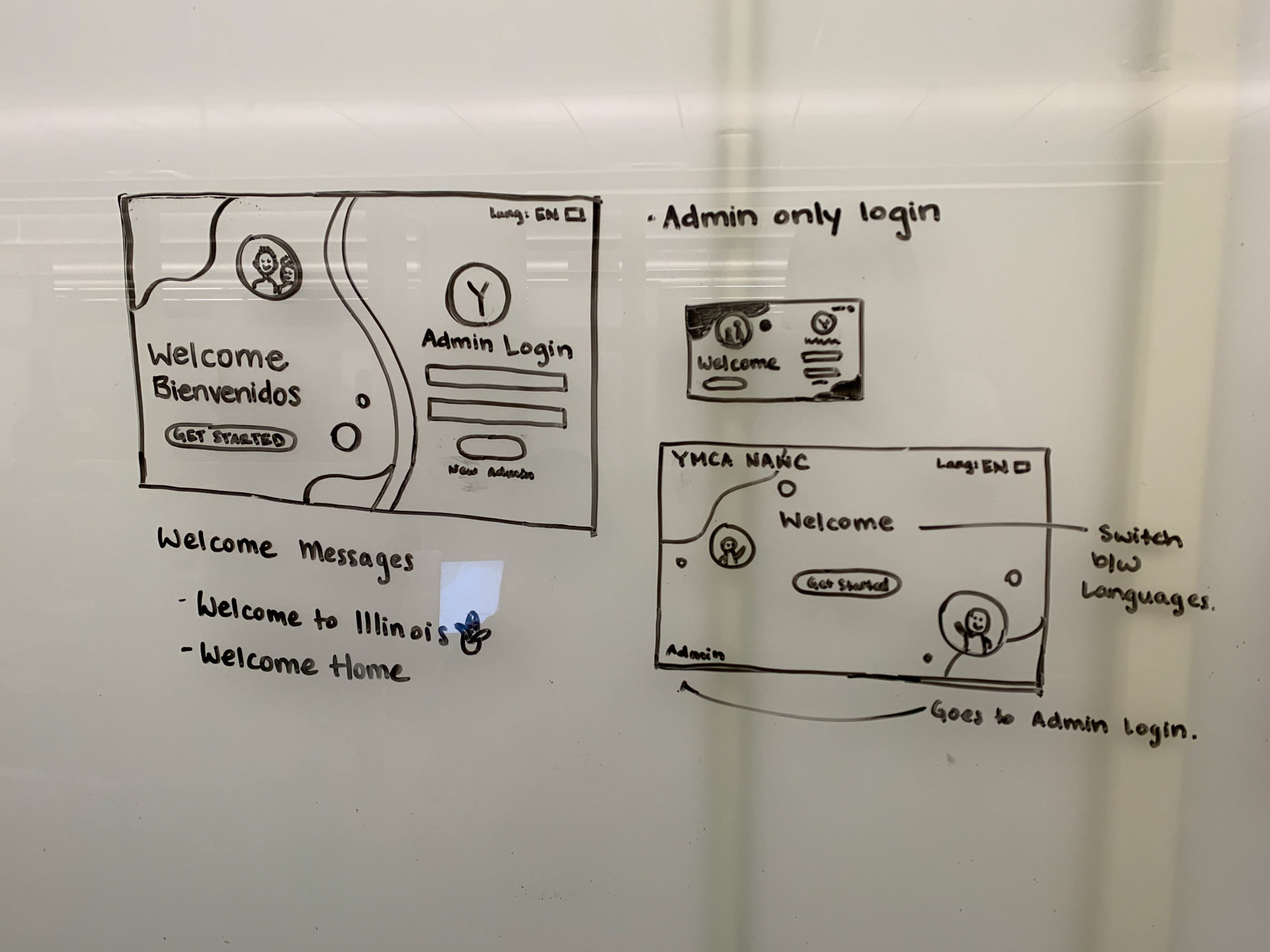
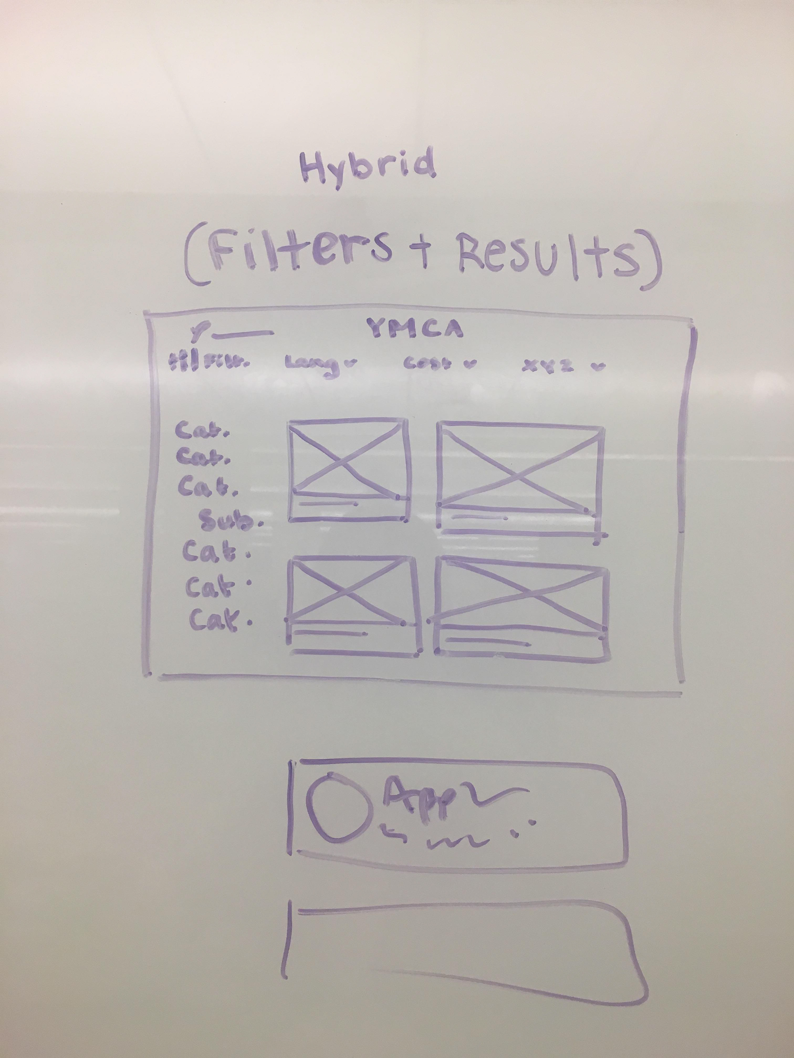
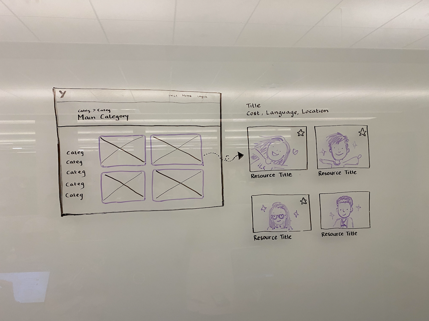
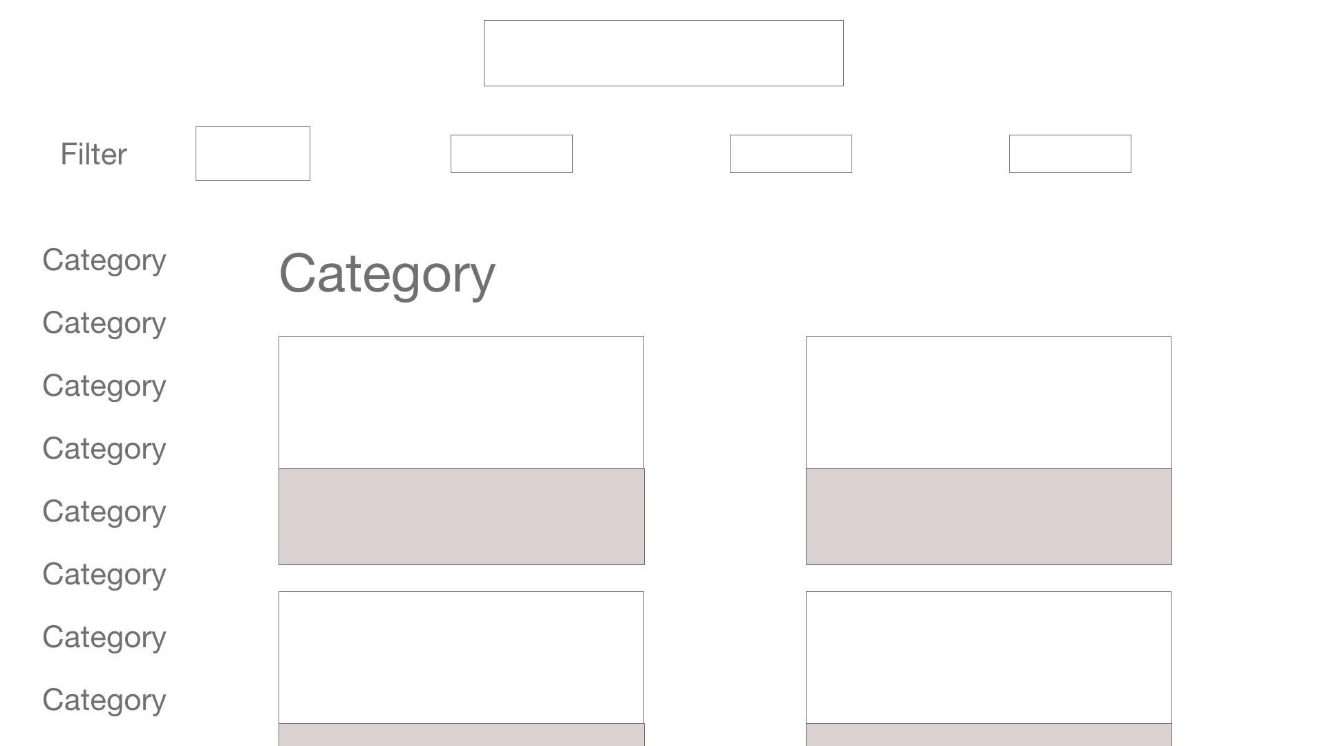
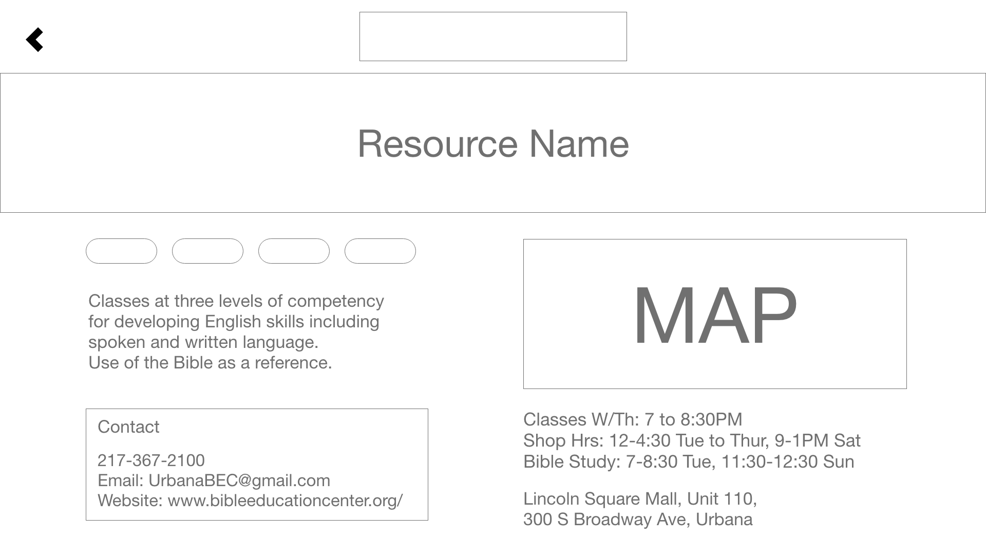
Initial Wireframes
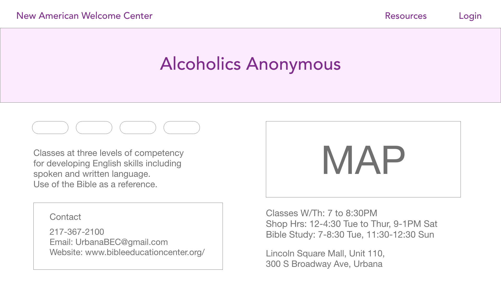
I initially specified the necessary pages for the product while brainstorming the skeleton of the product so developers could start developing, even if the exact user flow and journeys weren’t finalized. This is a brand new product and we explored different solutions and sketched out the user flows for easy access to information.
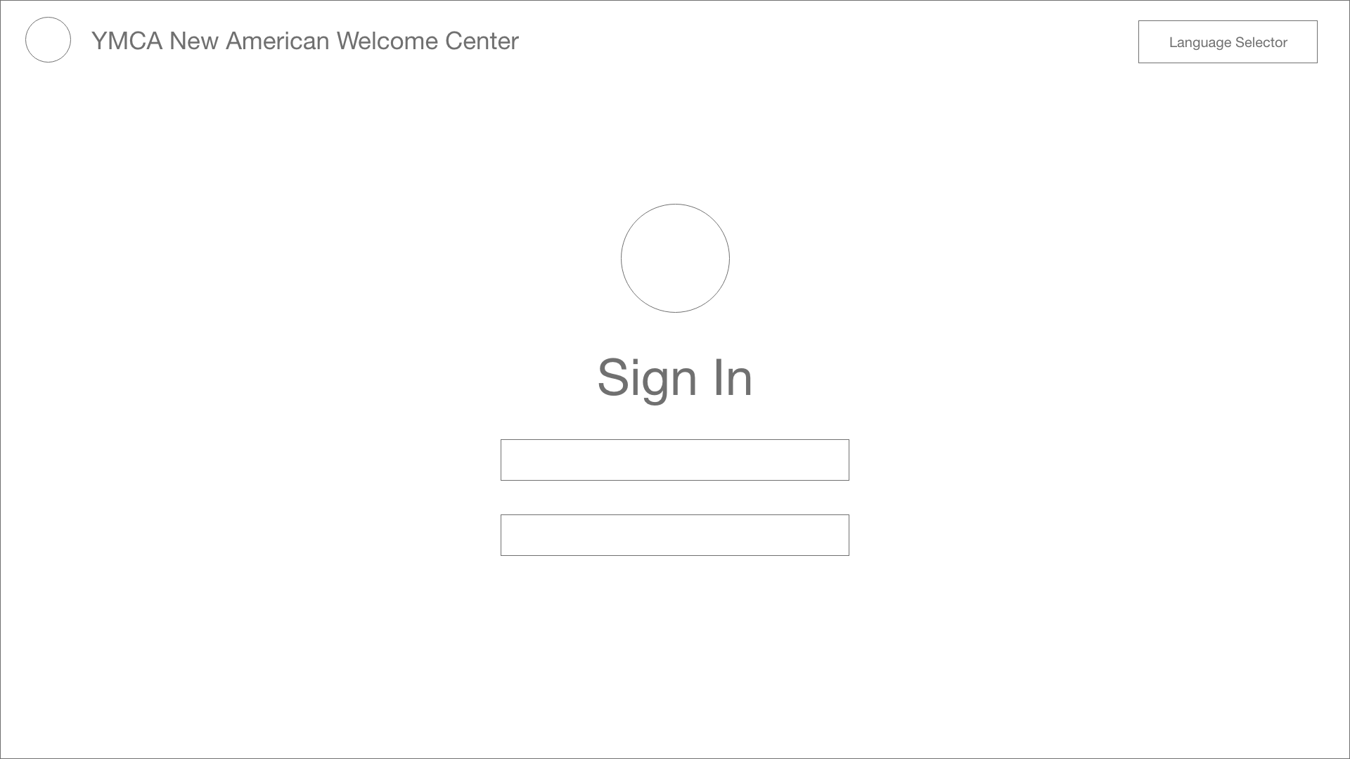
Iteration 2
Usability Tests
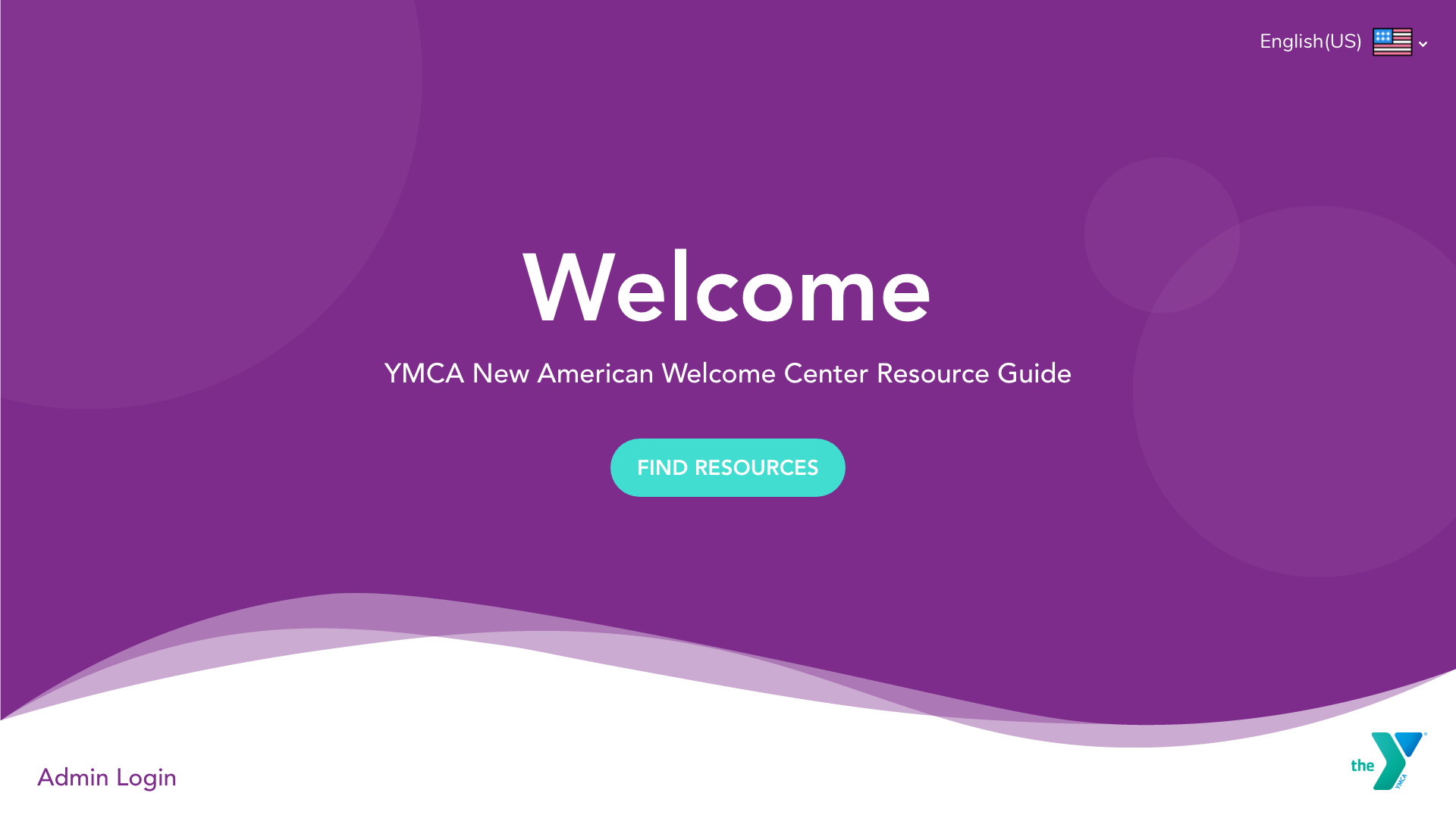
We then went to immigrants, resource providers, and NAWC employees at their location to test our designs as we iterated. We went in with the understanding that we were not designing for immigrants but designing with immigrants.
We did basic screening, asked about their initial impressions, performed expectancy tests and task scenarios.
Our goals were:
- Can users easily navigate to the resources page? (click “Find Resources”)
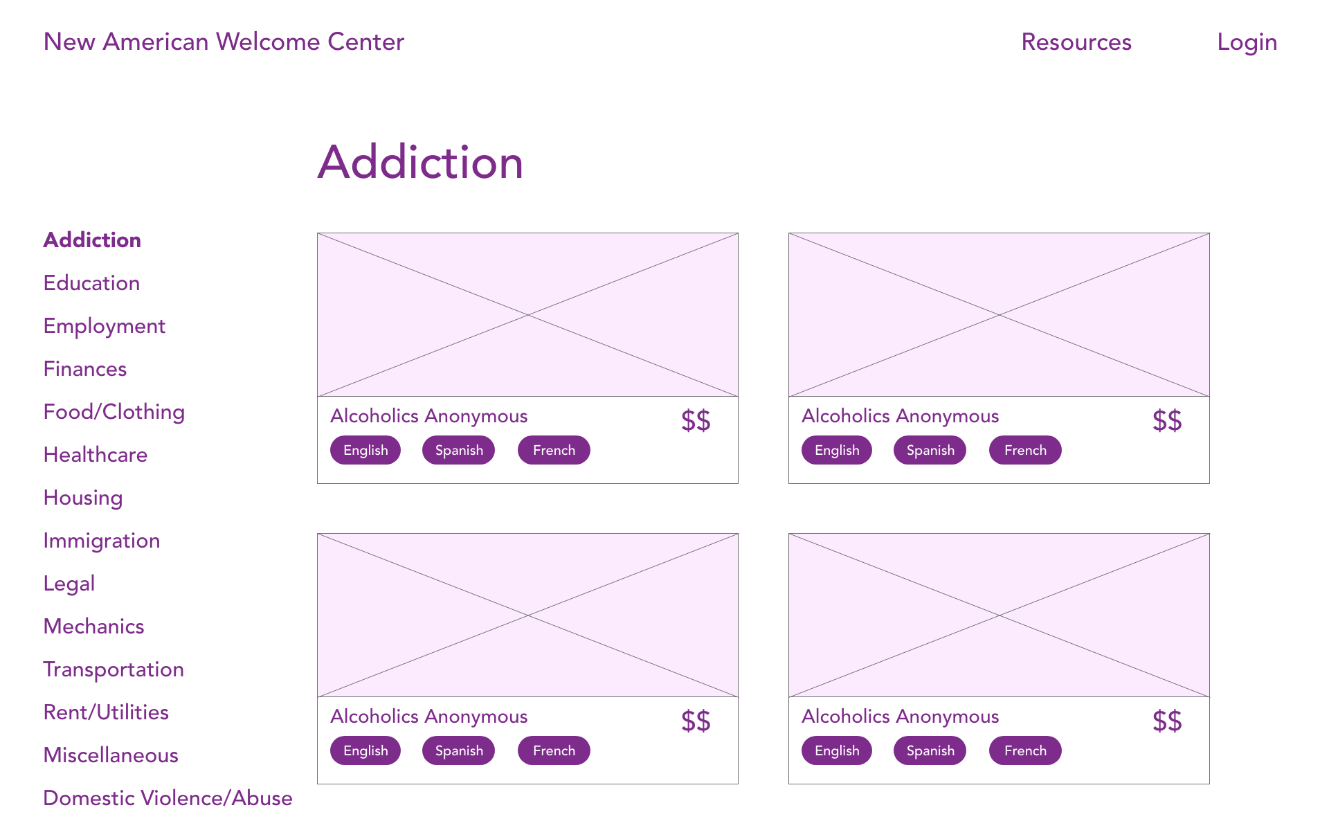
- Are all 3 filters (cost, language, and location) intuitive to use? Are they helpful? Are there filters that we did not consider?
- How relevant is the information shown on the individual resource page? Was there any missing information?
High Fidelity Prototype
Mobile Designs
The Team
Read more about the YMCA New American Welcome Center Project here:
